
Posted At: Feb 08, 2026 - 281 Views
In graphic design, color is never just color. It’s emotion, depth, storytelling, and visual direction — all working together. One of the most powerful techniques designers use today is color blending. When done right, blending colors can transform an ordinary layout into a visually stunning piece of art.
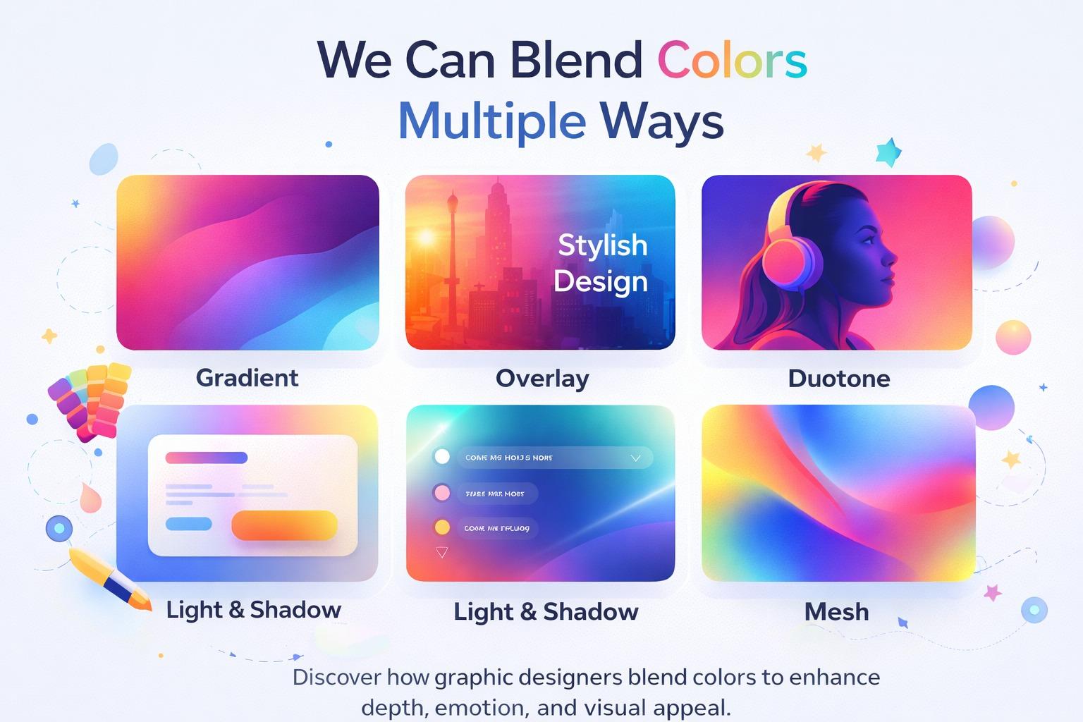
Let’s explore how graphic designers blend colors in multiple ways to create modern and engaging designs.
🎨 Why Color Blending Is Important in Graphic Design
Flat colors can look clean, but blended colors add dimension and energy. They help designs feel more dynamic, professional, and visually interesting.
Color blending can:
- Add depth to flat layouts
- Improve visual flow
- Highlight important elements
- Create emotional impact
- Make brand visuals more memorable
That’s why you see blended colors everywhere — logos, posters, social media posts, websites, and digital ads.
🌈 1. Gradient Blending
Gradients are the most common and versatile blending style in graphic design. They smoothly transition between two or more colors.
Used in:
- Poster backgrounds
- Social media creatives
- App and website UI
- Logo accents
Soft pastel gradients feel elegant and calm, while bold neon gradients feel energetic and futuristic.
🌤️ 2. Transparency & Overlay Blending
Designers often place semi-transparent color layers over images or backgrounds. This technique blends color while keeping the original texture visible.
Perfect for:
- Event posters
- Banner ads
- Website hero sections
This helps improve text readability and creates a stylish, modern tone.
🔥 3. Duotone Effects
Duotone blending uses two contrasting colors applied to an image or graphic. It turns regular photos into bold, artistic visuals.
Popular in:
- Music cover art
- Fashion posters
- Creative agency branding
Duotone designs stand out instantly and give a strong personality to visuals.
💡 4. Light, Shadow & Glow Blending
Blending isn’t only about switching colors — it’s also about how colors interact with light and shadow. Adding soft glows, highlights, and shadows creates a layered effect.
Best for:
- UI design elements
- Product mockups
- Icons and illustrations
This technique gives designs a semi-3D look while keeping them clean and modern.
🌊 5. Mesh Gradients & Multi-Color Blends
Mesh gradients blend multiple colors in a smooth, flowing way. Instead of a straight transition, colors move organically across the design.
Common in:
- Tech brand visuals
- Startup websites
- Presentation slides
- Creative backgrounds
This style feels premium, futuristic, and highly artistic.
🎯 How to Choose the Right Color Blend
Different blending styles create different moods. A designer must match the blending technique with the project’s purpose.
| Design Goal | Best Color Blend Style |
|---|---|
| Clean & Professional | Soft gradient |
| Bold & Eye-catching | Neon gradient |
| Creative & Experimental | Duotone |
| Modern & Premium | Mesh gradient |
| Elegant & Minimal | Light overlay |
The key is balance — too many colors can feel chaotic, while subtle blends feel refined.
✨ Final Thoughts
Color blending is one of the most exciting tools in modern graphic design. It allows designers to move beyond flat visuals and create depth, mood, and personality.
The next time you design a poster, social media post, or brand visual, experiment with how your colors blend. A simple shift from flat tones to blended transitions can completely elevate your design.
Because in graphic design,
how colors blend is just as important as which colors you choose. 🎨